Learn
The Markets at All-Time Highs. Should I be Worried? Technically … No.
Chris Brown, Vice President —
Investments, Synovus Securities, Inc.
We have seen a continuation of higher highs for the markets in 2024. This includes the S&P 500 reaching a new all-time high this past January and, most recent, the NASDAQ Composite making all-time highs at the end of February. Surprisingly, the Dow 30 (Dow Jones Industrial Average) reached its all-time high in December of 2023. Many retail investors become apprehensive when it comes to investing in the stock market when they reach all-time highs for many reasons. Some reasons include, “I don’t want to buy at the top” or “I think the market is overvalued,” or based on the most recent comments that I have heard, such as, “I’m going to wait to buy on the dip.”
Before we get into the long-term historical data on all-time highs in the markets, here are some suggestions to bring us back to basics. Investors must ask themselves three important questions before they invest in the equity markets.
- What is my investment objective? Is it to grow your funds for a specific event? Maybe retirement, saving for a child’s college, a wedding, or to buy a house? It may be a good idea to define your investment objective so you can understand how to compartmentalize your funds according to your growth timeline. This brings me to the second key investment question …
- What is my time horizon for my investment? Am I planning to buy a home in the next 12-to-24 months? Am I planning on retiring within three to five years? Answering these questions will allow you to measure how much risk you can afford to take and define the amount of money you can invest within the markets, bringing me to the last question that every investor should ask themselves ….
- What is my risk tolerance? Many investors are allured by attractive AI Tech-like returns without understanding the potential downside risk of owning a high-growth sector. Staying invested during turbulent market conditions can determine the difference between investment success and financial ruin. Understanding these three fundamental questions can help you make rational decisions for an appropriate investment plan to weather multiple market conditions.
All-Time Highs: How Long Before We Crash?
The honest answer is nobody knows if and/or when a large stock market crash will come. Many self-proclaimed experts have posted videos on social media, written blogs and created podcasts around “The End is Near!” — on why the next crash is just around the corner. Most of these online prognosticators follow up with, “Subscribe to my newsletter that’s only X amount a month, and I will keep you informed on when the crash is coming and how many buckets of rations you can buy from my website to keep you and your family safe.”
Sound familiar?
I say this with a bit of tongue in cheek, but many of these “experts” are out there profiting off fear because they have mastered a powerful tactic — namely, bad news outsells good news all day, every day. My job as an advisor is to shut out the noise and analyze the markets starting from a 30,000-foot view. Reviewing historical market data can help create some understanding on what happens when the markets are making all-time highs.
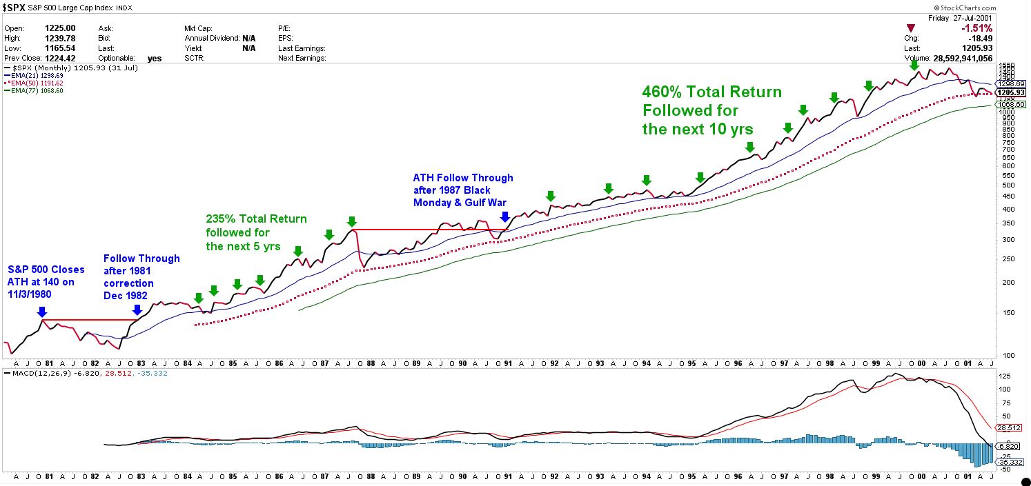
Using technical analysis of the broad markets, we examine two charts below and explain indicators that show the proverbial cracks in the market that have led to major historical downturns in the S&P 500 over the past 44 years. The reason why the markets move down varies from cycle to cycle but, as you’ll see below, the price indicators tend to remain the same. The below charts are shown on a monthly table where each movement is measured in monthly increments. This allows us to view the long-term secular bull and bear markets while silencing the shorter-term cyclical bull and bear markets. Though cyclical markets are still important to study, I wanted to focus on a broad historical view of the S&P 500 while illustrating the technical setups for secular bull and bear markets. Historically, secular bull markets have lasted an average of 17 to 20 years with an average return of 408%, while secular bear markets tend to last 8 to 12 years with a 65% average loss.1 This price history also falls in line with why the stock market is up two-thirds of the time (and down the other third), over the long-term cycles.
S&P 500 Monthly Chart (1980-2000) — Secular Bull

Source: http://stockcharts.com
The S&P 500 chart listed above shows the month-to-month S&P price line in black/red (black for positive monthly returns and red for negative) and spans a little more than 20 years. The blue line represents the 21-month moving average; the red dotted line represents the 50-month moving average; and green illustrates the 77-month moving average. Think of these colored moving average lines as caution signals for the markets when the price line touches or passes below these levels. If the S&P 500 price remains above all three monthly moving averages and the monthly moving average lines appear to be sloping in an upward direction, then this would signal, “We are cruising at a safe speed even though we may feel a few bumps ahead.”
If the S&P 500 price touches or passes below the 21-month moving average (blue line), this may signal caution ahead, but it’s still safe to move forward. When the price touches or crosses below the 50-month moving average (red dotted line), that may signal, “Dangerous cliff ahead, slow your roll, and hands at 10-and-2 on the wheel!” Lastly, the 77-month moving average (green line) may indicate, “Lock your windows and doors, proceed with extreme caution, and do not feed the bears surrounding your vehicle.” Now that I have provided some definitions to the charts, let’s review a bit of historical context that ushered the S&P in to the 1980s bull market.
In 1973, the S&P 500 entered its first secular bear since the Great Depression and 1929’s stock market crash. The S&P established an all-time high in January 1973 of 120 and did not return to that all-time high level until July in 1980; it peaked at an all-time high of 140 for that year and ultimately recorded a calendar-year return of +32%. Keep in mind this was all done while the Federal had raised the Fed Funds rate by 2% — making the Fed Funds rate nearly 20% — a stark contrast to our 5.50% Fed Funds rate in 2024. After a six-month correction that followed in 1981, the S&P 500 entered into its second historical secular bull market since the “Nifty Fifty” and added an additional 235% total return for the next five years. In October 1987, “Black Monday” created a sell-off where the S&P 500 was down 20% in one day and it took the index until July of 1989 to regain the all-time high once again. It continued the secular bull market until its peak in August of 2000, adding an additional 460% total return. Two important observations for this 20-year chart: first, the S&P 500, even during “Black Monday,” never crossed below the 50-month moving average (red dotted line). And, second, during secular bull markets — which I believe we are in at this time — the market price will either drop close to, or touch, the 50-month moving average then reverse to the upside, making new market highs.
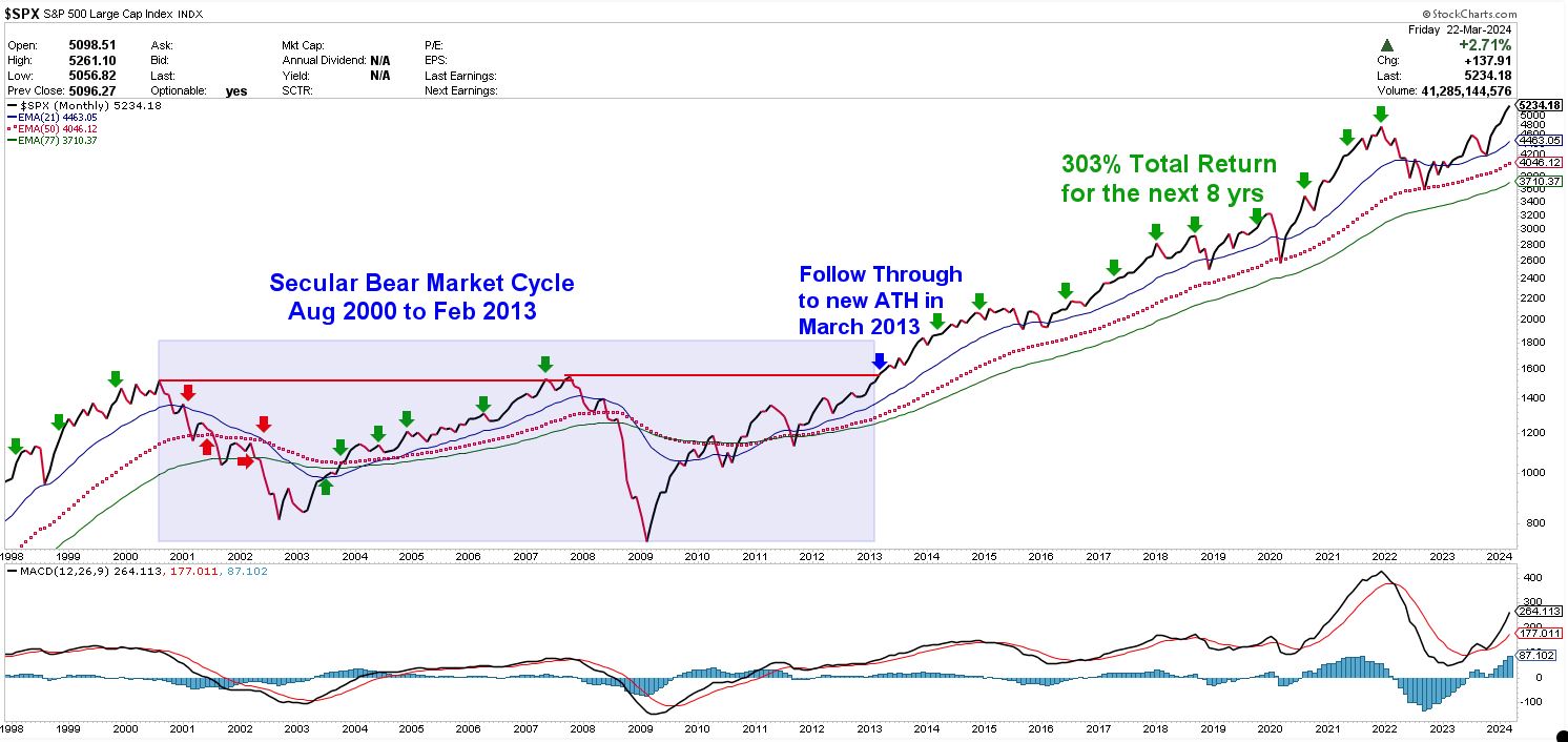
S&P 500 Monthly Chart (1998 -2024) — Secular Bear to Secular Bull

Source: http://stockcharts.com
This second chart is a continuation of the first chart, with the same monthly timeframe and same monthly moving average (MA) lines; with only the dates pulled forward to understand the broad view of the S&P 500 price when it drops below the 21-month (blue), the 50-month (red dotted), and the 77-month (green) MA lines. As you can see, as indicated in the red arrows, the 21-month MA line starts forming a downward sloping pattern and even crosses below the 50-month MA, and the 77-month MA. This indicator is called the death cross. Properly named, this signal indicates the current pain in the stock market and may signal close to a market bottom. Market technicians follow this indicator on the monthly, weekly and daily price charts as they scroll in to look a near-term price activity.
It is not until August 2007 that the market regains and makes an all-time high, then fails to regain any higher price momentum. The 20-month MA line starts its downward sloping movement signaling another breakdown below the 50-month and 77-month MA in the end of 2008 and beginning of 2009. It is not until 2010 when the S&P 500 price line moves above all three colored MA lines, with a short dip in 2011, and then makes a breakout to new all-time highs in 2013. From the new all-time highs in 2013, the S&P 500 proceeded to make a 303% return until December of 2021. Notice the COVID-19 low in 2020 (just past the third green arrow from the top)? Is it just a coincidence that the S&P 500 price touched the 50-month moving average before returning to the secular bull market run? Perhaps. The chart does not mention government stimulus, purchase power parity and all the other government policies implemented during this time. It only shows price and the monthly moving averages.
The markets in 2022 were one of the most unnerving near-term corrections, posting one of the largest drawdowns for both stocks and bonds together in a single calendar year in the history of the markets. Notice in the top right corner of the chart as the market price drops below the 21-month MA and, again, touches the 50-month MA before resuming its upward trend. Another coincidence? Perhaps. Again, technical analysis of the markets only follows price and where the price of the markets is going in relation to the moving averages displayed on the chart.
There are hundreds of technical analysis tools available to make your own thesis of where the markets may go next. Viewing the markets with a long-term historical approach may provide a way to drown out the noise and not focus on what you think the market is going to do, but what the market is actually doing. Downtrends do not fall out of thin air. Bear markets start like a small burning ember that eventually ignites a small fire and grows into something much larger.
As I mentioned earlier, historically speaking two-thirds of the time the markets move in a positive upward direction. Mark Twain has a famous quote that is used among many technical analysts, “History doesn’t repeat itself, but it often rhymes.”
Understanding these simple market data key points may help you create your own conclusions and return to the three key questions in the beginning of this writing. Formulating a personal guideline for your investment objectives, time horizon and risk tolerance may allow you to create a financial plan that can withstand the uncertainties and volatility in almost any market scenario.
Important disclosure information
Asset allocation and diversifications do not ensure against loss. This content is general in nature and does not constitute legal, tax, accounting, financial or investment advice. You are encouraged to consult with competent legal, tax, accounting, financial or investment professionals based on your specific circumstances. We do not make any warranties as to accuracy or completeness of this information, do not endorse any third-party companies, products, or services described here, and take no liability for your use of this information.
- Jennifer Nash, “Secular Market Trends: Bull and Bear Markets,” published March 7, 2024. Back

